CSS3 엘리먼트 변형 3D (Transform 3D) 매트릭스 이용
매트릭스를 이용해 3D변화는 무궁무진하다. 하지만 2D에 비해 좀 어여운게 사실. 삼각함수 회전 정도는 이해한다는 가정에 포스팅한다.매트릭스를 바로 체험 해볼수 있도록 링크를 걸어두었다. (웹킷기반 브라우저만 지원)

http://sianasiatiger.cafe24.com/study/matrix3dexplorer/matrix3dexplorer.html
스크롤바를 조절하여 결과를 볼 수 있을 것이다. 이제 하나하나 살펴보자.
4열 은 투시도법이다. 그외 것은 아래설명
1. 디폴트 : 아무변화 없는 그대로다. 단위 행렬이다.
  [1,0,0,0],
  [0,1,0,0],
  [0,0,1,0],
  [0,0,0,1],
2. 크기변환 : 대각선의 S값을 변형시킨다
  [s,0,0,0],
  [0,s,0,0],
  [0,0,s,0],
  [0,0,0,1]
3.회전: 순서대로 X,Y,Z축 회전 한에 대한 회전하려면 4개의 값은 알아야한다. 각도는 라디안이다
  [1,0,0,0],
  [0,cos(a), sin(-a), 0],
  [0,sin(a), cos( a), 0],
  [0,0,0,1]

  [cos( b), 0, sin(b),0],
  [0,1,0,0],
  [sin(-b), 0, cos(b), 0],
  [0,0,0,1]

  [cos(c), sin(-c), 0, 0],
  [sin(c), cos( c), 0, 0],
  [0,0,1,0],
  [0,0,0,1]
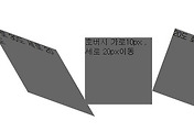
4. 이동 : 맨아래 행이다. 순서는 X,Y,Z
  [1,0,0,0],
  [0,1,0,0],
  [0,0,1,0],
  [tx,ty,tz,1]
이를 이용한 예제는 아래에서 보자. hrml은 아이디 #stage 의 div와 거기에 img 엘리먼트 5개가 전부다.
http://www.eleqtriq.com/wp-content/static/demos/2010/css3d/matrix3dgallery.html?iframe=true&width=850&height=626
div#stage{ -webkit-perspective: 600px; }

img { -webkit-transition-property: -webkit-transform;
      -webkit-transition-duration: 0.7s;
	  -webkit-transform: matrix3d(0.7109, 0, -0.703279,
	                              0, 0, 1, 0, 0, 0.703279,
				      0, 0.7109, 0,
				      0, 0, 0, 1);
	  -webkit-box-reflect:below 15px -webkit-gradient(linear,
                              left top, left bottom,
	                      from(transparent),
                              color-stop(0.7, transparent),
                              to(#ff0000));
     }

img:hover { -webkit-transition-property: -webkit-transform;
            -webkit-transition-duration: 0.7s;
	    -webkit-transform: matrix3d(1, 0, 0, 0,
                                        0, 1, 0, 0,
                                        0, 0, 1, 0,
                                        0, 0, 200, 1);
          }


댓글